Recently, Fair Isaac (FICO) asked the provocative question, “How does your #FICO Score compare to the rest of the US?”
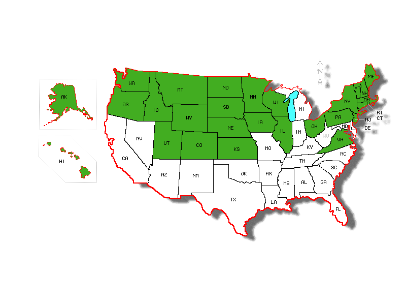
The accompanying link leads a new homepage at the company’s consumer-oriented website, myFICO.com. It features an interactive map of the United States on which you can see a national average credit score (692) and averages for individual states. The state with the highest average credit score in the country is North Dakota, at 720.
The map below shows the above average states in green, and the below average states in white.

The state-by-state breakdown is a departure for FICO, who has never answered the same type of illustration published years ago by national consumer reporting agency and competitor Experian. Unfortunately the basis for the Experian map was the infamous Fake-O score, the PLUS score. But despite that, let’s face it: It was, frankly, full of Fake-O FICO funky fun. Fair Isaac gets that.
Today, for its part, Experian seems to have moved on to yet another gambit: The highly-touted (media are suckers for anything new), VantageScore. NationalScoreIndex.com (the address that previously hosted the map) now forwards to something called Live Credit Smart (click on “The State of Credit” on the left menu). The interactive PLUS score map (similar to FICO’s) that was on the homepage at NationalScoreIndex.com is now at http://www.nationalscoreindex.com/USScore.aspx (if you care).
Confused about which score is relevant? You should be. In 2008, FICO told creditscoring.com that the TransUnion version sold on myFICO.com is FICO Risk Score, Classic 98 which is not the model mentioned in the Fannie Mae lending guidelines (section B3-5.1-01 (p. 427, pdf p. 455)). On the other hand, the Equifax score at myFICO is, indeed, the same score mentioned by Fannie. But, the one thing that the score used for mortgage lending or even the myFICO.com score is not is something called “FICO 8.” Fair Isaac states, “When a significant number of lenders have upgraded, we will work with the credit reporting agencies to provide FICO 8 scores to consumers here on myFICO.”
Yet, FICO 8 is the score model in countless blog posts by FICO personnel as if it is significant. They have not mentioned the shiny new map. Yesterday’s commentary about the distribution of consumers by score doesn’t even bring it up.
It is anybody’s guess which score model is represented in the US state map. And it used to be all about the median not the mean (“average”). And there is a new AOR (with the typical, cliché wordplay right in the press release title). And a new CEO, a board member. And no coming to terms with the employers thing even as the rest of the world is enlightened (albeit with, in one case, a strange, contradictory result). Still, some keep the myth going.
Wonks, you have got to love this. Stay tuned.
